


INTERVIEW:

In 2026, bkk UNZINE is working with our featured artists to develop the themes for each month’s issue.
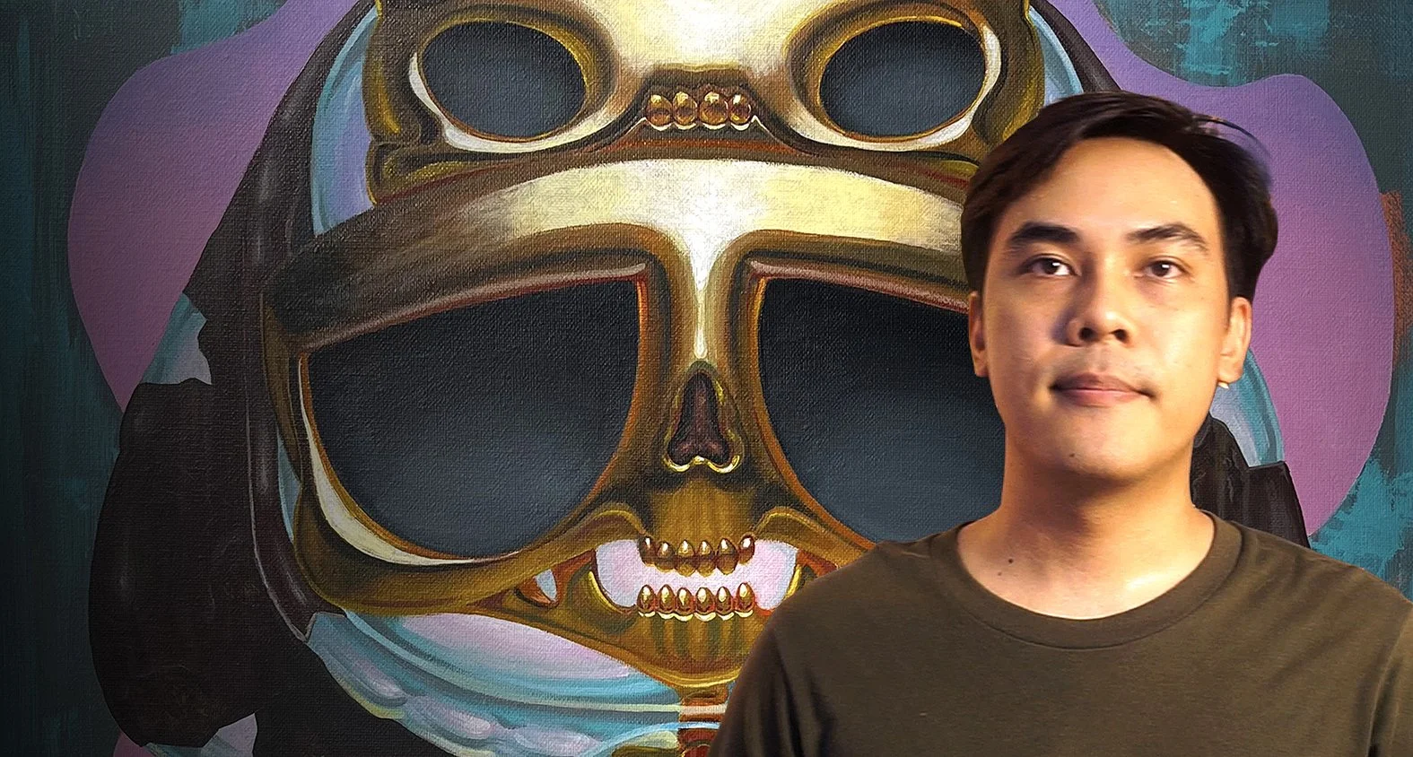
This month, we’re kicking off the lead up to festival season and thrilled to have Jeng, AKA Gee.Illusions, as our featured artist. A multi-talented illustrator, painter and designer, Jeng is the creator of Think Boy and colorist of the wildly successful Ronin of Okane series from Cyber Sheep Studios, with whom bkk UNZINE is partnering to bring you some very exciting programming for the upcoming BKK Comics Art Festival (stay tuned to bkkunzine.com for announcements!) at the Bangkok Art and Culture Centre this October. In this interview we discuss with Jeng his background, thoughts on color theory and his experience as a thriving freelance artist in modern day Thailand. Also be sure to check out Jeng’s and other artists’ submissions for the “Vibrant” theme in the July 2026 issue of bkk UNZINE, as well as the video interview conducted by our good friend Top, AKA ImAimDoodles!
You studied visual art communication in university… Did you always intend to pursue illustration and comics work, or did you have other plans originally?
Absolutely! I've wanted to work in illustration since I was in fourth grade. So after graduating from university, I immediately became a freelance illustrator.
What did you start out drawing as child? Did you draw mostly with line or did you already play with colors when you were younger?
When I was really young, the only art tools I had were pencils, erasers, and a few blue pens, so I mostly practiced by drawing. I didn't start learning color until high school, when I bought a used drawing tablet from a friend. I learned by studying and imitating the coloring styles of my favorite artists on YouTube until I eventually developed my own. I think I was a slower learner than most of my friends, haha!
Did you have any early inspirations? Were there any characters or cartoons or specific subjects that appealed to you?
If I had to choose what inspired me the most as a child, it would be Akira Toriyama's Dragon Ball. The vehicle designs, the characters, the line work, the use of color— everything in that series made me want to draw it in my notebook during those boring afternoon math class sessions hahaha! Even now that I'm older, sometimes when I look at my own drawings, I can't help but see the smooth curves and the alternating blue and green colors in my work that remind me of the legendary work of Dragon Ball.
How would you describe your artistic style? Can you tell us how your style has evolved over the years?
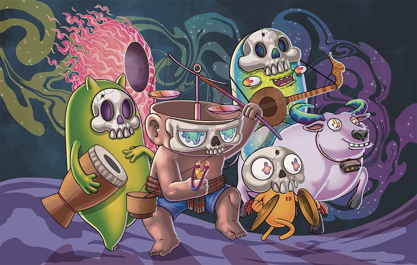
Haha... it's hard to explain! My work has gone through many different styles over the years. I started with a humorous, comic-magazine style, then moved toward something edgier, before eventually coming back to a cuter style. But if there's one thing that has stayed consistent, it's the way I tell stories. I think that's my real artistic style. The visual style changes depending on what best serves the story I'm trying to tell.
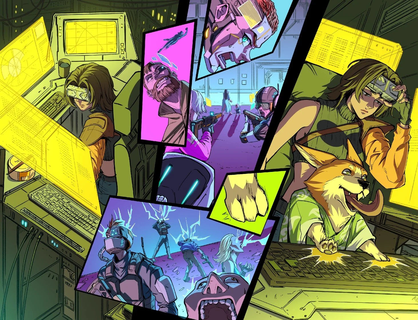
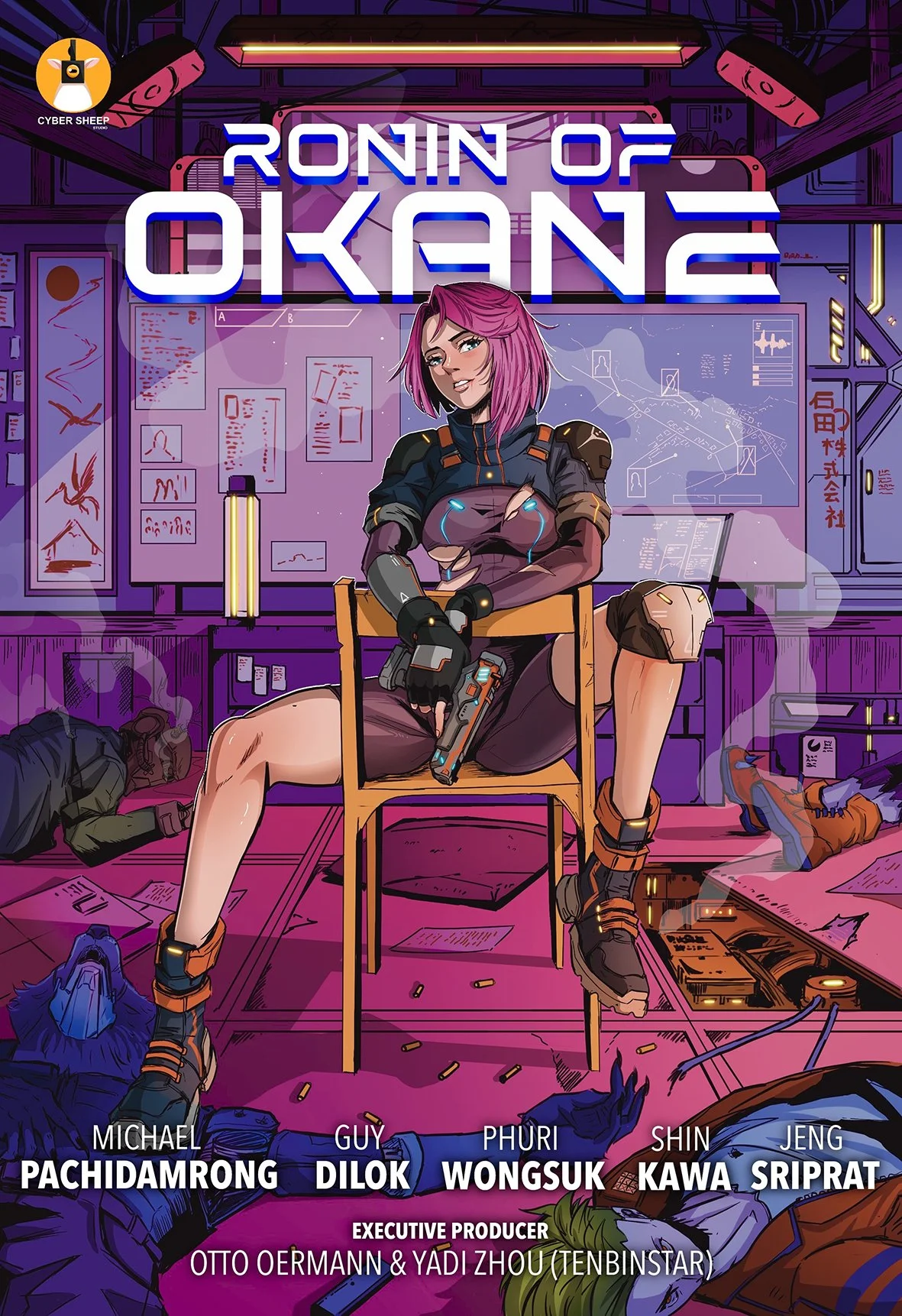
For example, in Ronin of Okane, I used neon colors to reinforce the cyberpunk atmosphere, not because neon is "my style," but because it was the best choice for that story.
What things did you learn from studying visual art communication that you still find useful or adhere to now?
The most important thing I learned is that we study art for communication. The key point for what I learned was how to make sure that people who see our work understand it immediately and find it easily accessible. The success of the work is therefore focused on the client, not ourselves. This led me to practice thinking about marketing plans. Reading the target audience is like studying art alongside commercial skills, which is crucial in this era.
Everything is measured by the success of communicating to a large group of people first, before guiding them to delve deeper into the context that the creator wants to communicate. I feel that this makes it easier for us to adapt to the modern era.
You started out with t-shirts… were they purely your own designs or based on established properties and concepts?
Those were completely new designs. Let me explain… back then there were two types of OVP (overprint) t-shirts. The first type was called bootlegs, which were shirts made by taking existing designs and cutting and pasting them into new shirts; they were like parody t-shirts.
The type I made, however, were originals, meaning that all the designs came entirely from my imagination; the designs and drawings were all new. The OVP shirts from that era had become more collector's items than simply shirts to wear.
What were common types of commissions that came your way when you were starting out?
I think a lot of artists can probably relate to this. In the early days, most of my commissions were for stickers, logos, and album covers. But once I started creating more of my own canvas paintings, things began to change. That's when I started receiving more commissions for paintings instead.
What types of stories or themes do you like to touch upon in your illustrations?
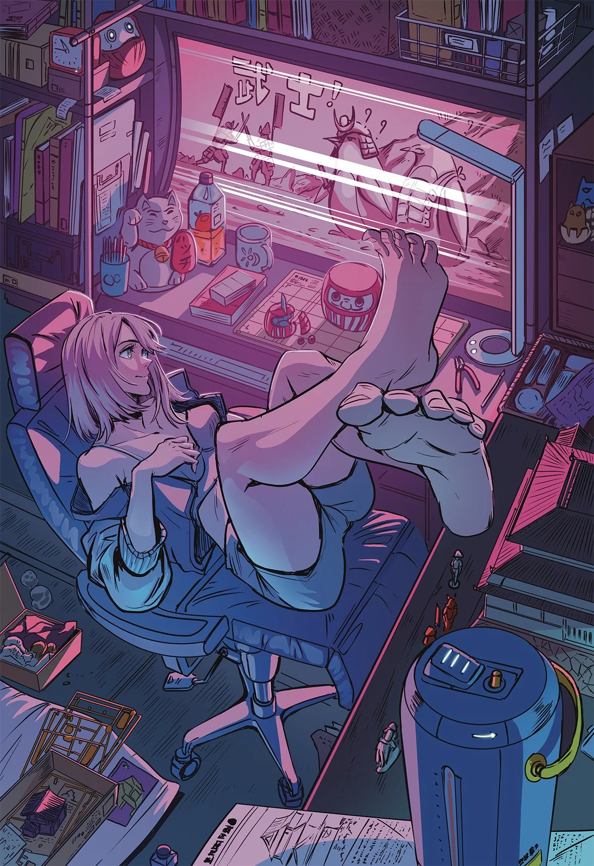
Human. Human nature, to be precise. Okay, this might sound a little crazy, haha, but the stories I like to tell in my personal work are often about inner feelings, searching for something, or trying to escape something within our own minds. I guess I'm just drawn to abstract concepts.
Can you tell us about Think Boy?
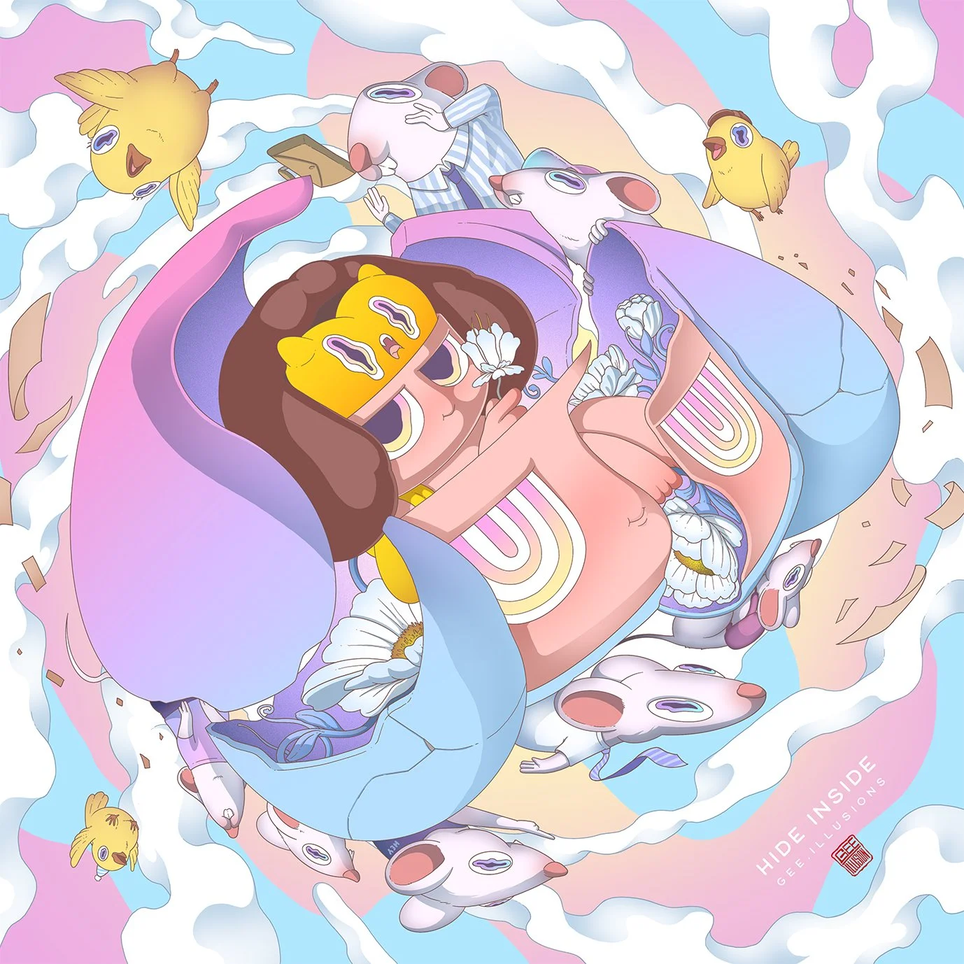
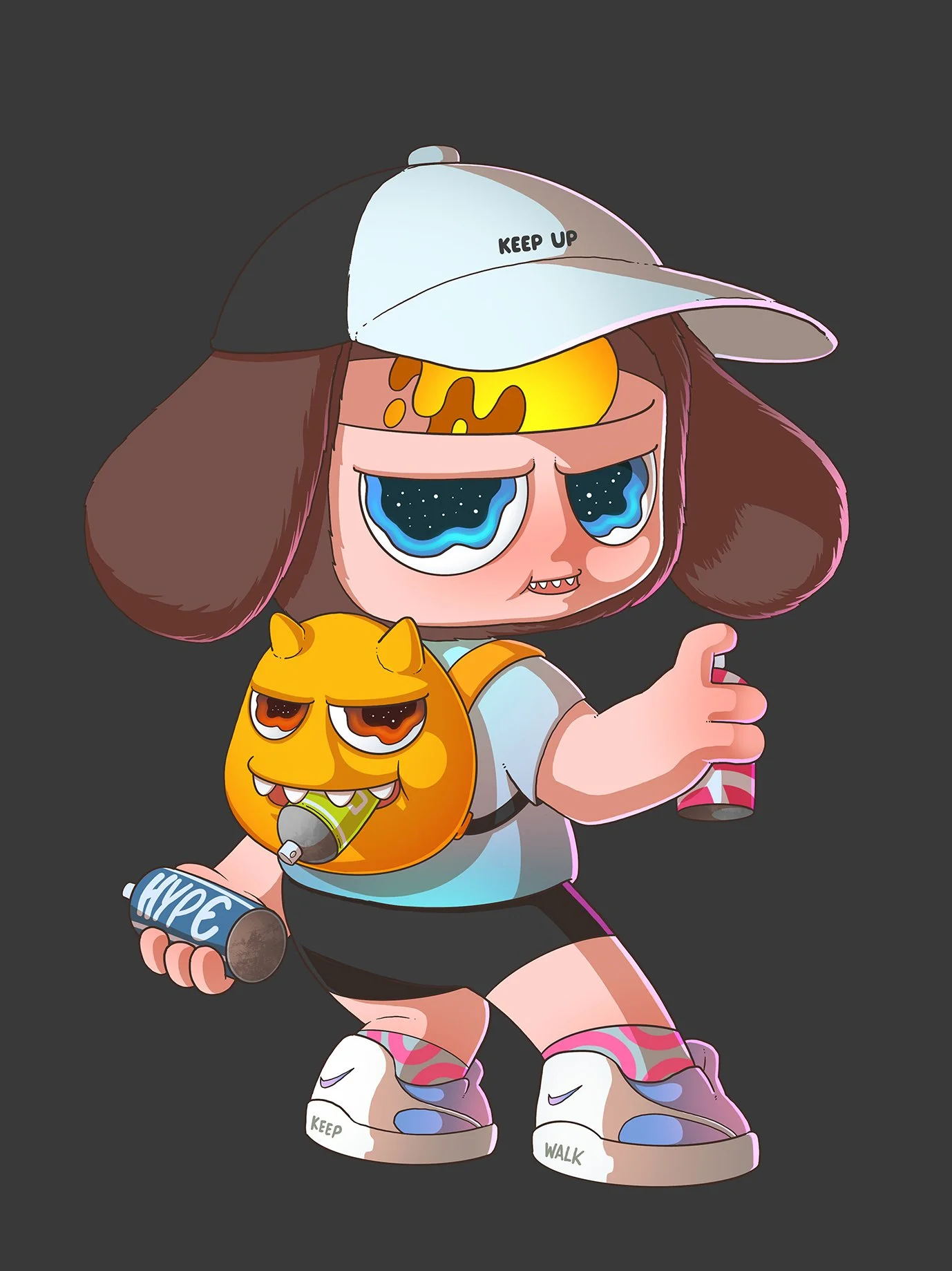
Think Boy is a character I created as a medium to represent the feelings and desires of others in society— people who want to say things but can't, so they choose to express them through images in their minds instead. That's why Think Boy has a window above his head that projects the things he's thinking about.
In the beginning, I spent two full months designing this character, to ensure it reflected my vision as closely as possible and would resonate with the general public. It was incredibly difficult to create a perfect character. During the development process, I constantly adjusted certain aspects of the character, working on it continuously to ensure the best design possible.
Do you still do commission work today or are you mostly busy with ongoing projects?
Yes! Despite my busy schedule, I'm still accepting commissions, but not as frequently as I used to. To be honest, I'm actually uncomfortable making clients wait. Even if they tell me they're happy to wait, I still feel guilty. That's why I only accept commissions on a case-by-case basis now, haha!
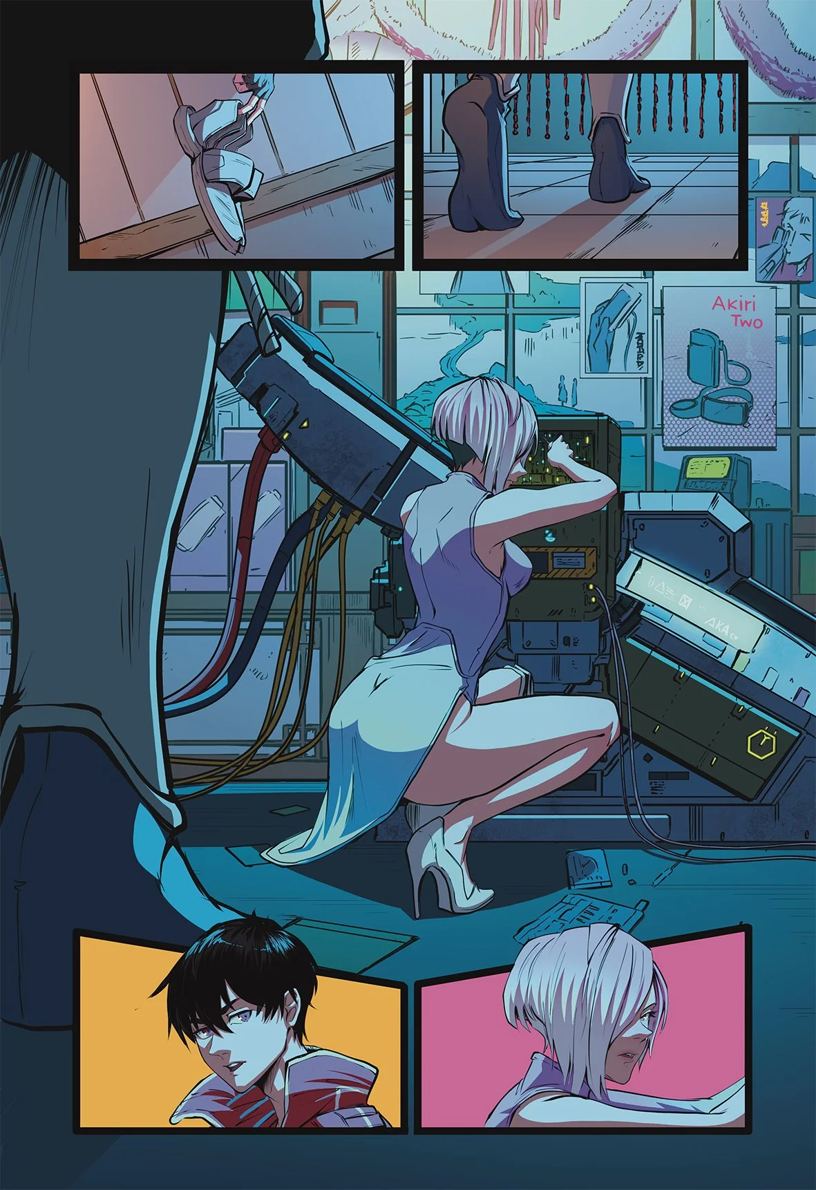
You’re also part of the team that produces Cyber Sheep Studios’ acclaimed Ronin of Okane comic book series. The color design of that comic series is fantastic and has rightfully been praised. Can you tell us a bit about the choices for the color palette and how it’s used to enhance the story?
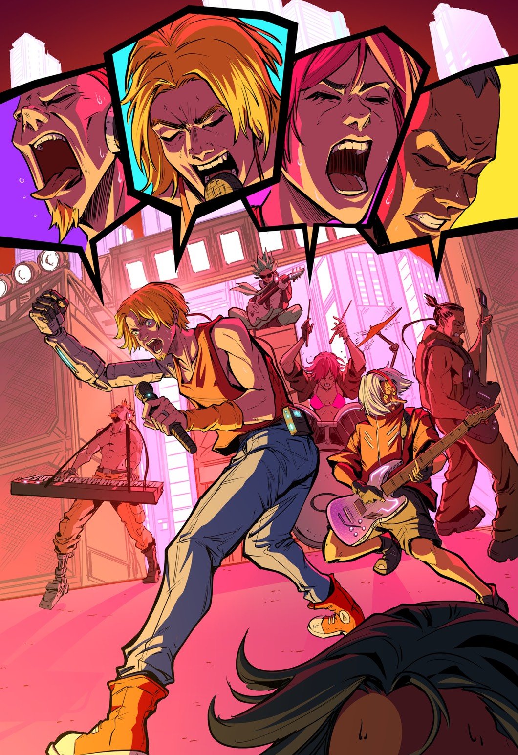
When it comes to colors, I always consider the context of the scene: what the characters are doing and why. Then I select colors that match the atmosphere to emphasize the mood of the scene. For example, in a sword fight scene, choosing colors with strong contrasts between light and shadow, along with vibrant colors, helps make the action feel more intense. In addition, the direction of the light hitting the subject is also very important to the storytelling.
“Adding color to a work is like adding life to it, adding to the soul of the body of the puppet that we created. I think that coloring is about making those imagined worlds come alive.”
Would you say that those colors are your own preferences or do you have a different visual style for personal projects?
Mostly, it's due to personal preference, haha!
What’s your thought on color comics as opposed to black and white comics?
It's a completely different feeling. Some comics are black and white partially due to production costs, as some stories need to focus on mass production. Reducing costs by going black and white helps mitigate this problem without compromising the comic's content and readers can still connect with the story since it’s also a valid artistic choice. Of course, many black and white comics are intentionally that way by the creators’ design.
However, for colored comics, I think color can enhance the content even further and allows readers to see characters' emotions more clearly. It's like a cherry on top.
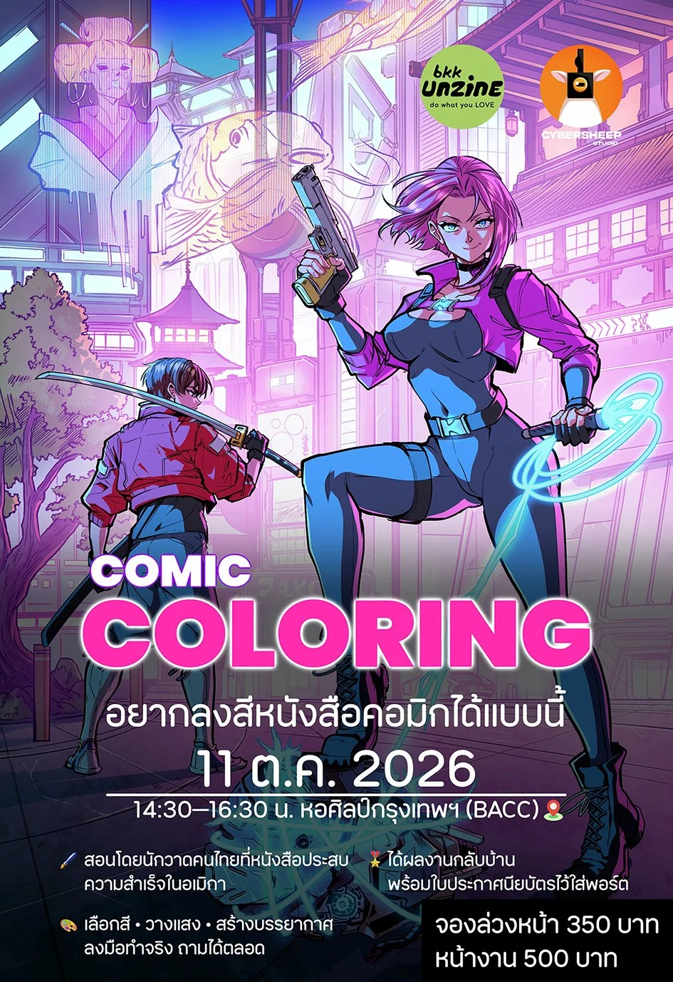
bkk UNZINE is really excited to have you and Cyber Sheep Studios join us for the upcoming BKK Comics Art Festival in Bangkok this coming October, where you’ll lead a coloring workshop. What would you like to convey about the role color plays in comics storytelling and what do you hope attendees will learn from the workshop?
In this workshop, I'll walk everyone through the techniques I've developed over the years while coloring Ronin of Okane. This year, we raised over 3 million baht on Kickstarter, and I want to share the knowledge and techniques behind the distinctive coloring style that helped our work stand out. I hope everyone leaves with practical techniques they can immediately apply to their own illustrations and comics, whether they're just starting out or already creating their own work. It’ll be a fun time where participants can try their hand coloring special line art we’ll be providing and create a unique art piece that they can be proud of. I can’t wait to interact with everyone attending!
Click below to register for Gee.Illusions’ special coloring workshop at the BKK Comics Art Festival on 11 October!
Which leads us to this month’s issue, “Vibrant.” What’s the inspiration behind this theme?
Adding color to a work is like adding life to it, adding to the soul of the body of the puppet that we created. I think that coloring is about making those imagined worlds come alive. This is the origin of the “Vibrant” theme.
What are you working on currently and how can people follow your work?
Right now I'm working on an art toy project of the Think Boy character. I've actually been working on it for a while, but lately I've been focusing more on making art toys.
And I'll be participating in an exhibition in South Korea at the end of July. Please follow me on Instagram @Gee.Illusions.
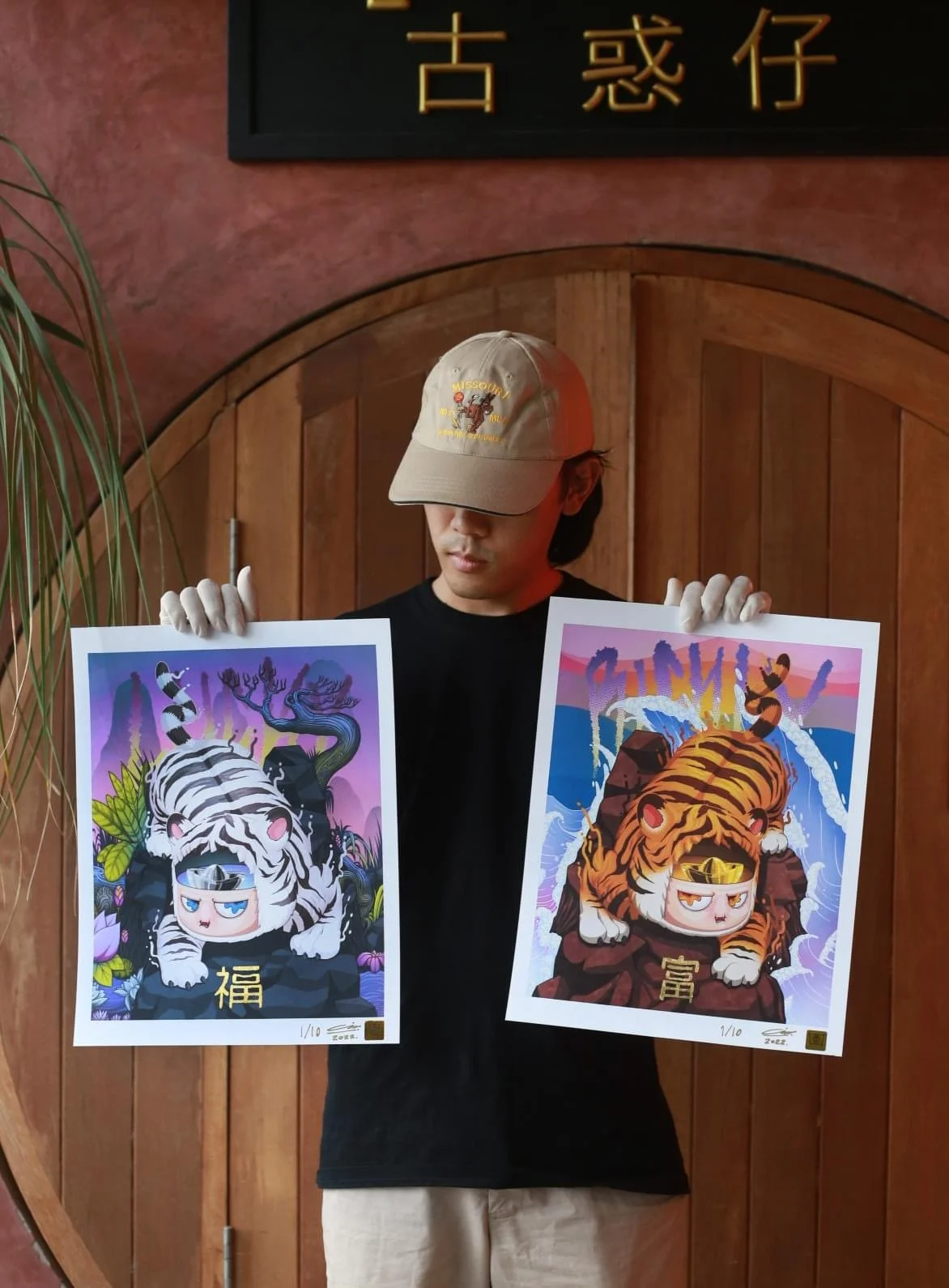
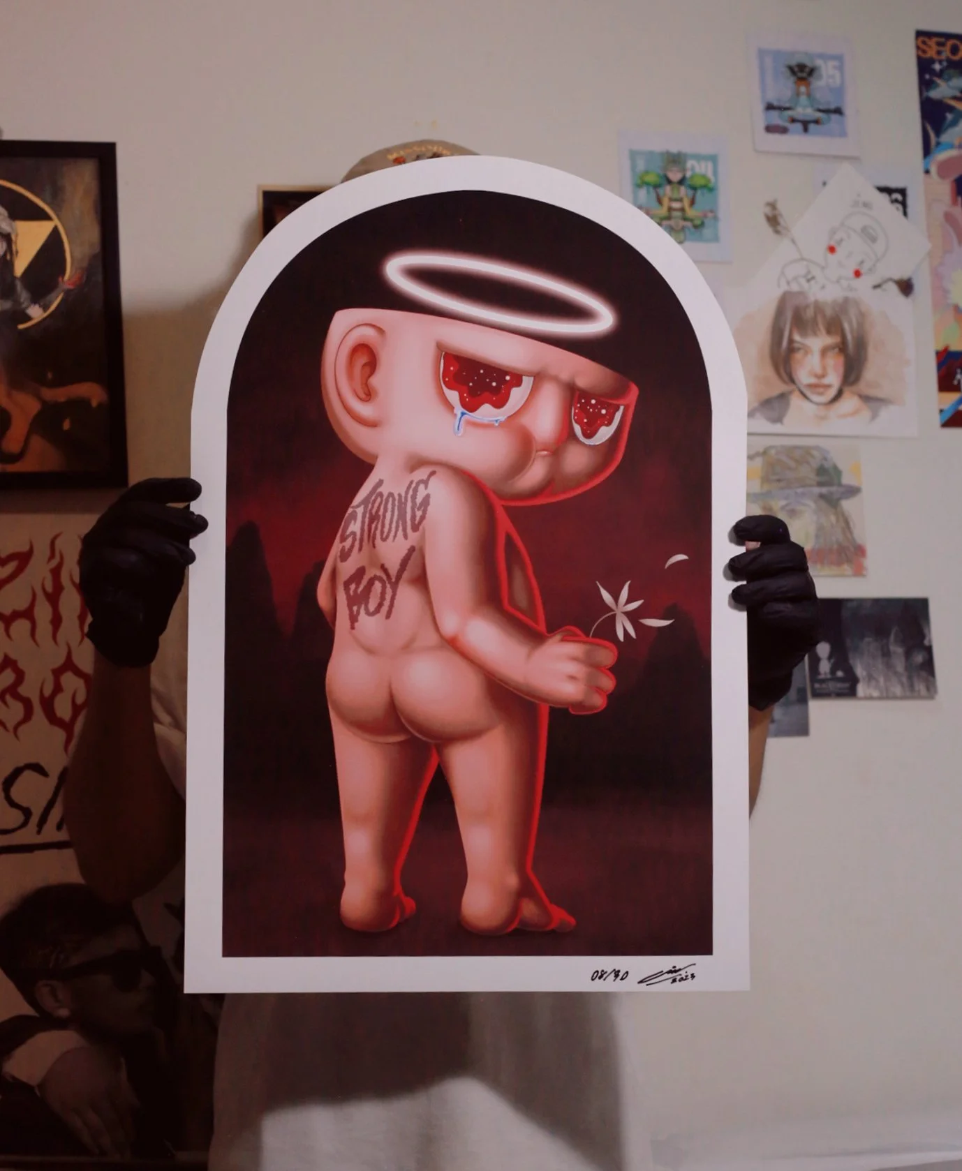
You’ve done sculptural work as well?
Yes, I have. In terms of large-scale sculpture, I once made a fiberglass sculpture of Think Boy.
You’re currently based outside of Bangkok right? How is art scene where you’re living?
I live in Ubon Ratchathani. The art community here is still steadily growing. It may not be as big as in Bangkok yet, but it's doing well.
What do you think about Thai art, both the form and the industry, as it is in modern times? How would you like to see it evolve into the future?
The art scene in Thailand still has a lot of room for growth, but it still needs understanding from the general public and much more support from influential figures in our country.
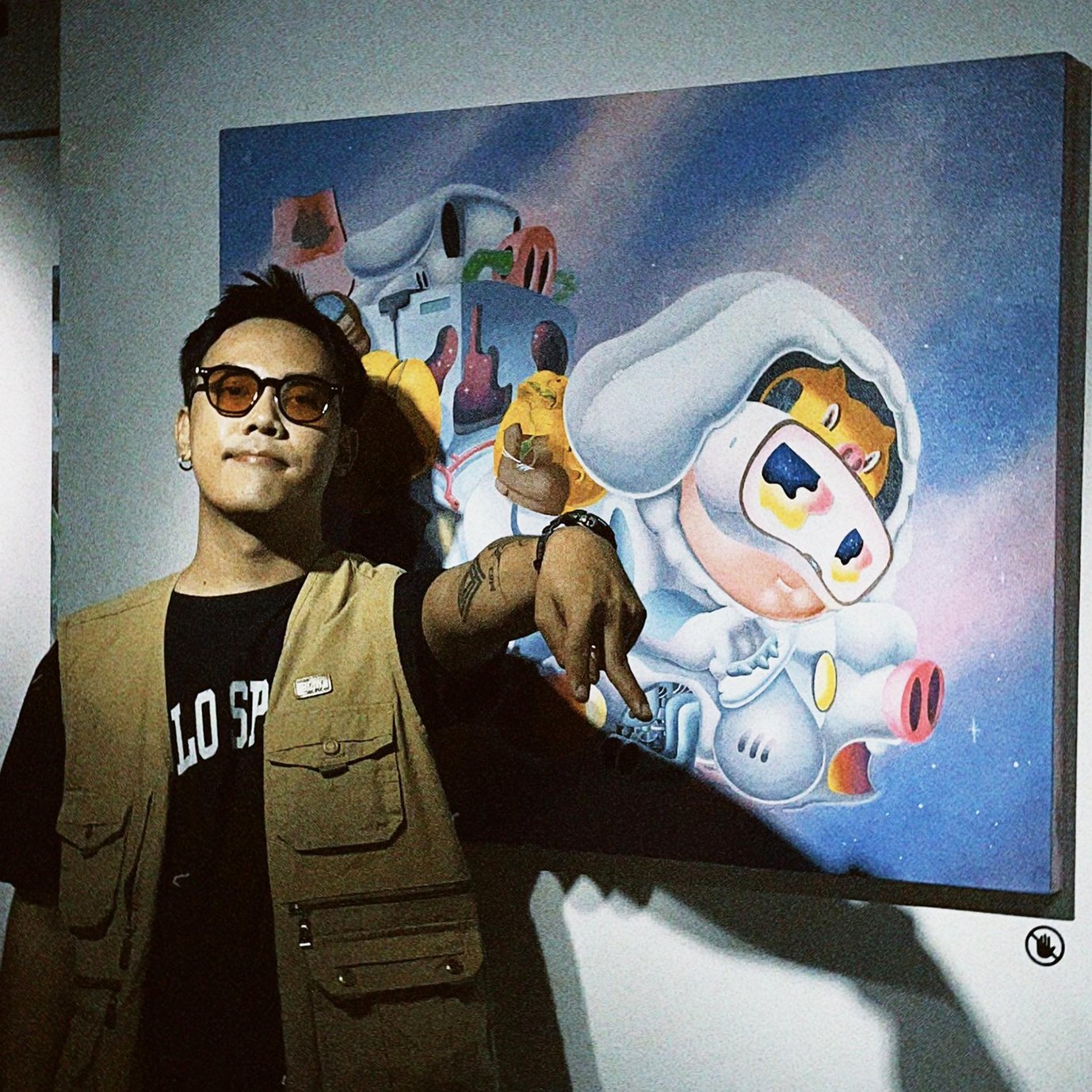
For more information on Gee.Illusions, visit his profile here for a brief biography and his social media links.
Special thanks to Cyber Sheep Studios for providing stunning artwork from Ronin of Okane.
Gee.Illusions colored the pages and poster images displayed throughout this article. Additional credits are as follows:
Guy W. Dilok, @Guy1994s_Official
Shin Kawa, @umi.kawa
Toom Ongarc, @toombjsang
Gee.Illusions’ entry for the July 2026 issue, “Vibrant,” can be seen in Issue 69 of bkk UNZINE, and don’t miss his video interview with ImAimDoodles at the link below!
Thanks to Gee.Illusions for making this interview possible, and keep an eye out for future collaborations with our featured artists!
